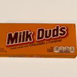
In this class, we were all randomly assigned a candy and a famous graphic designer. The candy I got was Milk Duds and my graphic designer was A.M. Cassandre. The goal of this project was to create a new candy box design for the given candy in the style of the graphic designer we were given. So in my case, I designed a new Milk Duds box in the style of A.M. Cassandre.
I started the project by doing some research into Milk Duds as a candy and looked at some of the different packages throughout its history. I found out that Milk Duds were first produced by F. Hoffman & Company of Chicago in 1928. They are now produced at the Hershey Company plant in Robinson, Illinois since 2000. Milk Duds got their name because the original manufacturer tried to make them perfectly sphere, but could not so they got the name “duds.” A fun fact about the product is that they were named “The Official Candy of Major League Baseball Players Association” by the Sports Collectors Digest in 1971. For a short time, Major League Baseball players were portrayed on the backs of Milk Duds boxes and could be collected as a version of baseball cards.


After my research I wrote my personal perspective on Milk Duds as a candy.
Milk Duds are caramel coated in chocolate, but I think the chocolate taste is more prominent than the caramel. They are very chewy though because of the caramel. I don’t think the design of the package reflects the contents at all, I think they rely more on how old and well known Milk Duds are rather than portraying what they are with the packaging. The package does say “Candy made with Chocolate & Caramel” though underneath the name so I guess that gives some insight to what to expect, although you might not know what shape they are solely based on that description. One thing I like about the font they used for the “Milk Duds” name, is that is has a white kind of stroke type thing on each letter, almost like a shine which is interesting because Milk Duds are coated in chocolate that does seem to have that same shine in the light. Since Milk Duds honestly doesn’t have that interesting of a shape or color that would make a super interesting design on its own, it might be nice to have a little cutout where you can see inside to the contents possibly? Apart from that though, I do believe the description makes it clear that you should be expecting a chocolatey, caramel candy and all of the nutrition information seems clear.
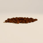
I also took my own photos of the Milk Duds box that I got.


After researching the candy, I started researching my designer, A.M. Cassandre and looking at his history, experiences, education, and works.
A.M. Cassandre was a graphic designer, typographer, painter, and more. He was born in Ukraine, but studied in Paris where he took painting workshops and later took part in a poster competition where he got third place.Cassandre committed suicide on June 17, 1968 and it was rumored that he was depressed throughout his life, but ended his life after his typography “La Cassandre” was not published. One of Cassandre’s most famous works was the YSL monogram. Much of his work was with posters, where he often used futurism and surrealism to bring some imagination into his works. His three part poster “Dubonnet” was similar to the gifs we have now. It is a poster portraying a man drinking, then refilling his wine glass and as the posters go on, they become more “complete” until the last poster is finished. Cassandre’s work is very interesting in that it uses flat colors and gradients and very thin, basic lines which are very similar to cubism. A lot of the works I found from Cassandre were designs for magazines and catalogs which I think helped him to stay relevant. He wasn’t doing smaller-end designs, but rather working with well-known magazines and products.
I picked out three distinct points I found out about A.M. Cassandre to guide my work which were:
- One distinctive things about A.M. Cassandre is that he was working in the era of Art Deco which started out as an opposite of Art Nouveau because of its angles and geometric shapes. This is interesting because Cassandre was working in an Art Deco style as it was starting to gain popularity.
- Cassandre had a contract with Hachard and Cie in 1924 and they had been publishing his works until 1927 when Cassandre was influenced to quit working with Hachard and Cie and switch to working with the printing firm Lille L.Danel which he designed posters for until his reputation became well known enough that he could start his own advertising company in the 1930s.
- Because of his experience with painting, Cassandre was able to use an airbrushing technique in his artworks, which is how he achieved that gradient-look in a lot of his posters. I think this is very significant to Cassandre’s works because I noticed nearly all of them used some form of gradient.
I also found some of his works that I thought to be the most interesting and inspiring.

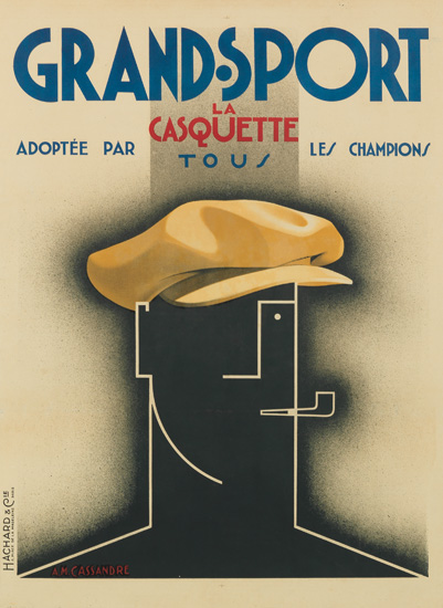

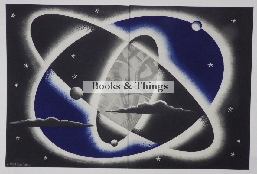
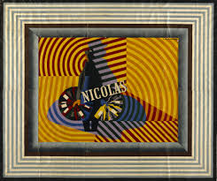
I ended up using the WILLI’S WINE BAR poster as my main inspiration for the Milk Duds packaging, but I also made a draft of what a Milk Duds packaging may look like if I worked off of the “Books & Things” poster.
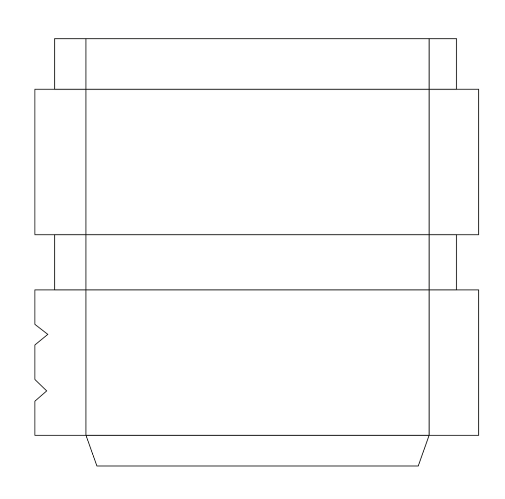
Before starting any work on the illustrations, I had to first create an outline of the Milk Duds box that I could use to work on so that when I assemble it it would be the correct size as normal Milk Duds packages are. I did this by scanning a milk duds package and putting it into Illustrator then traced it with the line tool.
Once I had my box and printed it to make sure it was the correct size when assembled, I started sketching out a few thumbnails of what I could do for my new design.


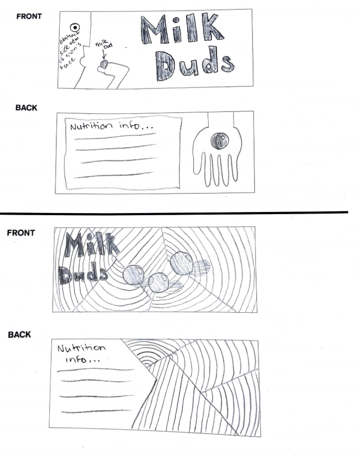

When we met in class, we picked two to create a draft in Illustrator of using color.


From these, I decided to go with the option on the right, and model it off of the “WILLI’S WINE BAR” I showed above. This meant that I would go with the red color and make it look as if caramel was pouring down from a spoon rather than a wine bottle and into a half circle/milk dud shape instead of a wine glass. I included the white and black outlines around the shape since that is an important piece of the original artwork. I also used a half filled half outlined font for the “MILK DUDS” writing since that is something Cassandre often does in his works.

I made a few minor changes from this and my final product ended up as:


I also made a gif using my final product to show how it looks in motion and to demonstrate the final product. I used Photoshop to do this.


Leave a comment